

Brand Identity
How the American Moslem Society looks, reads and sounds — the name, the mark, the colors, the type and the rules that keep them together.
Est. 1938 · Dearborn, Michigan
American Moslem Society
Contents
Outreach, Education, Development, Services · 1938
- 01The OrganizationNames, the four pillars, tagline, boilerplate and voice.
- 02The LogoFive patterns, three finishes, and when each is the right one.
- 03Logo RulesClear space, minimum sizes, backgrounds and misuse.
- 04ColorThe core four, the full ramps, and contrast obligations.
- 05TypographyFive faces, the type scale, and the rules for Arabic.
- 06Pattern & OrnamentThe ten-point girih star, the masjid skyline, the gold rule and the diamond divider.
- 07ApplicationsMastheads, buttons, cards and the prayer timetable.
- 08AssetsEvery logo file, and where the fonts come from.
This handbook prints from the browser. For the best result choose Letter portrait, enable background graphics, and set margins to Default. The live version, with every logo file available for download, is at identity.amsdearborn.org .
The Organization
Names, the four pillars, tagline, boilerplate and voice.
The name
Five forms of the name are correct, each for a different job. The spelling Moslem is the one the founders registered in 1938; it is the organization’s legal name and is never modernized, however unfamiliar it looks today.
The four pillars
Everything the masjid does belongs to one of four pillars. They appear in this order, always, and they are the tagline: they set the navigation of the website, the sections of the calendar, and the way the organization describes itself in a single line.
Outreach
دعوة
also Da'wah
Introducing Islam to our neighbors and welcoming new Muslims. The website labels this section Da'wah; both names refer to the same pillar.
Education
تعليم
Three schools plus lectures, workshops and classes across every age group.
Development
تنمية
Building the campus and its facilities for the generation after this one.
Services
خدمات
Funerals, marriage, family consultation, social and humanitarian support.
The tagline
American Moslem Society
Outreach, Education, Development, Services
الجمعية الإسلامية الأمريكية
دعوة، تعليم، تنمية، خدمات
The masthead above is the canonical pairing: name and tagline, English left, Arabic right, equal weight. It is the header of every printed piece.
Boilerplate
Two fixed paragraphs. Copy them exactly rather than paraphrasing — they carry legal and historical weight, and a rewritten version is a version somebody has to check.
One line
The American Moslem Society, serving the Dearborn community since 1938.
Tax status
The American Moslem Society is a registered 501(c)(3) non-profit organization. Donations are tax-deductible to the extent allowed by law.
Voice
Plain before ornate
Say the thing. A family arranging a funeral at midnight needs a phone number and three clear steps, not a paragraph of warmth first.
Both languages carry equal weight
Arabic is never a decorative echo of the English. If a piece serves the congregation, the Arabic says the same thing, set with the same care.
Rooted, not nostalgic
1938 is a fact we state once and let stand. The tone is of an institution still building, not one curating its own history.
Hospitable to the newcomer
Assume the reader may not know what a khutbah is, where to park, or whether they are welcome. Answer all three without being asked.
Contact block
The standard footer block, in this order. Phone before email, because the people who most need it are calling.
- Formal name
- American Moslem Society (Masjid Dearborn)
- Main
- (313) 849-2147
- Address
- 9945 W Vernor Hwy, Dearborn, MI 48120
- Imam
- (313) 849-4416
- services@amsdearborn.org
- Web
- amsdearborn.org
The Logo
Five patterns, three finishes, and when each is the right one.
One mark, five patterns. They are not five logos and not a set to choose between on taste — each is cut for a shape of space, and picking the right one is a question of the format in front of you. The mark itself never changes: a crescent holding the masjid, with the letters A, M and S built into the crescent as three kufic bars.

- Aspect
- 0.883 : 1
- Artboard
- 238.21 × 269.86
- Minimum
- 40px tall on screen · 0.45in in print
- In use
- amsdearborn.org footer, reversed white on ink
Simple
The mark on its own: a crescent enclosing the masjid — dome, two minarets — with the letters A, M and S built into the crescent as three stacked kufic bars. No plate, no wordmark.
Use it for
- Do: Anywhere the name is already present in the layout
- Do: Watermarks, embossing, tote bags, signage, embroidery
- Do: A repeating element in a pattern or endpaper
- Do: The footer of a page whose header already carries a full lockup
Not for
- Do not: As a profile picture — crops square and loses the minarets. Use Round
- Do not: As a first introduction to an audience that does not know the organization
- Do not: Beside a separately typeset "American Moslem Society" — use Long or Full instead

- Aspect
- 1 : 1
- Artboard
- 328.69 × 328.69
- Minimum
- 32px square on screen · 0.35in in print
- In use
- amsdearborn.org favicon; the yearly calendar masthead at 0.7in
Round
The mark centered on a circular plate, the crescent filling the disc edge to edge. The plate is part of the drawing and always runs opposite the artwork — white plate with a maroon mark, or maroon plate with a white mark.
Use it for
- Do: Favicons and app icons
- Do: Social profile pictures on every platform
- Do: Over photography, where the plate guarantees the mark stays legible
- Do: A masthead where the mark sits inline with type at the same optical weight
Not for
- Do not: Adding your own ring, border, drop shadow or outer glow
- Do not: Cropping the plate to a square or rounded rectangle — export at the plate edge
- Do not: Placing it on a ground the same color as its plate
- Aspect
- 1.114 : 1
- Artboard
- 468.87 × 420.83
- Minimum
- 40px tall on screen · 0.5in in print
- In use
- The prayer timetable masthead, reversed white on maroon at 1in
Full
The vertical lockup: the mark stacked above the English wordmark, with the Arabic name set directly beneath it. The wordmark is drawn in Gill Sans Nova and is part of the artwork — it is never re-typed.
Use it for
- Do: Tall or roughly square formats — covers, flyers, posters, program booklets
- Do: Centered compositions: title pages, certificates of the plainer kind, step-and-repeat backdrops
- Do: The masthead of a printed piece where the width is shared three ways
Not for
- Do not: Wide, short spaces — it forces the mark small to fit. Use Long
- Do not: Separating the mark from the wordmark to re-space them
- Do not: Setting the Arabic line at a different size or in a different face
- Aspect
- 3.484 : 1
- Artboard
- 940.19 × 269.86
- Minimum
- 120px wide on screen · 1.25in in print
- In use
- amsdearborn.org header at 52px tall
Long
The horizontal lockup: the mark at the left, the English wordmark and the Arabic name stacked to its right and optically aligned to the mark. The default lockup — reach for this one first.
Use it for
- Do: Website and application headers
- Do: Letterhead, invoices, forms and email signatures
- Do: Banners, step-and-repeat headers, event signage
- Do: Any space wider than about three times its height
Not for
- Do not: Squeezing it into a narrow column — it goes below its minimum width fast
- Do not: Re-stacking it vertically. That lockup already exists as Full
- Do not: Placing anything in the gap between the mark and the wordmark

- Aspect
- 0.995 : 1
- Artboard
- 423.26 × 425.19
- Minimum
- 64px square on screen · 0.75in in print
- In use
- Held in reserve — no current production use
Decorated
The round mark ringed by a sixteen-point ornamental medallion, drawn in a deeper maroon (#391518) with small pierced roundels between each point. The most elaborate pattern, and the only one with a second color.
Use it for
- Do: Certificates, awards, commemorative plaques and seals
- Do: Eid, Ramadan and anniversary collateral
- Do: Foil, deboss and engraving, where the ornament is the point
- Do: The front cover of a printed booklet — once, at scale
Not for
- Do not: Interface chrome of any kind — headers, favicons, buttons, avatars
- Do not: Anything below 64px, where the roundels fill in and turn to mud
- Do not: Using it as the everyday mark. Its authority comes from being rare
- Do not: Reproducing the ornament without the mark, or the mark without the ornament
Finishes
Three finishes, and no others. The finish is chosen by the ground the mark sits on, never by preference — a maroon mark on a dark photograph is not a style choice, it is an unreadable logo.
Maroon
#630d16The primary finish. Cream, white or light photography.

White
#ffffffReversed. Maroon, ink or dark photography.
Ink
#1f1b16Single color. One-color printing, engraving, embroidery, fax.
The Round pattern is the exception worth knowing: its plate always runs opposite the artwork, so the Maroon finish is a maroon mark on a white plate (for dark grounds) and the White finish is a white mark on a maroon plate (for light grounds).
Logo Rules
Clear space, minimum sizes, backgrounds and misuse.
Clear space
Keep a margin equal to the height of the crescent’s opening — the gap between its two horns — clear on every side of the mark. Nothing enters it: no type, no rule, no photograph, no page edge, no other logo. When in doubt, give it more; the mark has never suffered from too much room.
The dashed field is the exclusion zone, not a border to draw. It never prints.
Minimum sizes
Below these the minarets close up and the kufic bars stop reading as letters. If a space is smaller than the minimum for the pattern you want, change pattern rather than shrinking further — that is exactly what Simple and Round are for.
| Pattern | Screen | Below this, use | |
|---|---|---|---|
| Simple | 40px tall on screen | 0.45in in print | Nothing — this is the floor |
| Round | 32px square on screen | 0.35in in print | Nothing — this is the floor |
| Full | 40px tall on screen | 0.5in in print | Simple or Round |
| Long | 120px wide on screen | 1.25in in print | Simple or Round |
| Decorated | 64px square on screen | 0.75in in print | Round |
Backgrounds
On cream or white
The Maroon finish. This is the default and covers most of what the masjid produces.
On maroon or ink
The White finish. Never the Maroon finish on a dark field, and never a maroon plate behind it to compensate.
On photography
The Round pattern in its Maroon finish — the white plate is what keeps the mark legible over an image. Place it where the photograph is calm; if nowhere is, put the mark on a solid band instead.
Misuse
Each of these is a real thing that happens to logos. They are shown here so they are recognizable, not so they are options.
Do not recolor
The mark is maroon, white or ink. It is never tinted to match a campaign, a season or a photograph.
Do not stretch
Scale proportionally, always. A distorted crescent is the fastest way to make the whole piece look counterfeit.
Do not rotate
The crescent has one orientation. Tilting it for visual interest reads as an accident.
Do not add effects
No drop shadows, bevels, glows, gradients or outlines. The mark is flat, and its authority comes from that.
Do not screen back
A faded mark is not a watermark. If a watermark is wanted, place Simple at full strength in a tint of the ground.
Do not crop
The mark is never trimmed to fit a space, bled off an edge, or cropped into a square. Change pattern instead.
Above all
Never rebuild the mark, and never re-typeset the wordmark. Place the supplied file. The crescent’s curves, the spacing between the mark and the name, and the relationship between the English and the Arabic lines are all drawn — they are not something to reconstruct from a screenshot or approximate in a layout tool.
Color
The core four, the full ramps, and contrast obligations.
Four colors carry the identity. Maroon is the organization, gold is the ornament, cream is the paper and ink is the word. Everything else in this section is a tint or a shade of those four, kept on hand so a layout can have depth without reaching outside the family.
Maroon
#630d16
--color-maroon-800
The primary. Taken from the logo artwork itself, so the mark and the ground it prints on can never drift apart. Mastheads, headings, primary buttons, table headers, every large field of brand color.
11.4:1 on cream
Gold
#a88b5e
--color-gold
The secondary accent, and a strictly rationed one. Hairline rules, eyebrow labels, the diamond ornament, holiday tints. Never a background for text, never a button.
3.0:1 on cream
Cream
#faf7f2
--color-cream-100
The default ground. Warmer than white, and the reason the identity reads as paper rather than screen. Reach for pure white only inside cards, tables and dense print areas that need to separate from it.
Ink
#1f1b16
--color-ink-900
Body text, and the one permitted dark ground besides maroon. A warm near-black, never #000.
15.4:1 on cream
Maroon
The 800 step is the brand maroon and the only one that represents the organization. Everything above it is a tint for backgrounds, borders and hover states; everything below is a shade for depth. A tint is never a stand-in for the primary.
Cream
The paper. 100 is the page, 50 lifts a card off it, and 200 and 300 are the quiet separators that let a layout have structure without a single hard border.
Ink
Warm neutrals, tuned to sit on cream rather than on white. 900 is body copy, 500 is secondary copy, and nothing below 400 is ever used for text that carries meaning.
Production values
Five values that exist for a job rather than for the identity. They are documented so nobody has to guess at them again, and so nobody mistakes one for a brand color.
Contrast
The masjid publishes prayer times, funeral instructions and marriage requirements. People read them on a phone in a hospital corridor. Every pairing below is measured, and the ones marked decorative are never allowed to carry information on their own.
Proportion
Roughly two thirds cream, a fifth ink, a tenth maroon and a sliver of gold. Maroon reads as authority because it is rationed; a page that is mostly maroon reads as a warning.
Never
- Pure white as a page ground, or pure black as text.
- Gold as a fill behind text, at any size.
- A gradient between two brand colors.
- Green, blue or amber except in a status badge, where they mean a state and not the brand.
- A maroon tint standing in for the primary in a logo or a masthead.
Typography
Five faces, the type scale, and the rules for Arabic.
Five faces, each with one job. Fraunces speaks, Archivo explains, Gill Sans Nova signs the name, Foda titles the Arabic and Amiri writes it. A piece that needs a sixth face has a layout problem, not a typography problem.
A house of worship, a home for community.
Fraunces
Display serif
- Script
- Latin
- Weights
- Variable — 300 to 900, with opsz and SOFT axes
- License
- SIL Open Font License 1.1 — free for any use, including embedding
font-family: 'Fraunces', Georgia, serif
Google FontsEvery headline, every page title, every large number. Fraunces is the voice of the institution: a warm, high-contrast serif with enough character to carry a masthead and enough restraint to survive a legal-size timetable.
- Do: Set the opsz axis high (100–144) at display sizes and let it fall to 9–14 for anything under 20px. This is what keeps the serifs from clogging.
- Do: SOFT around 20 softens the terminals just enough for print. Leave it at 0 for small screen text.
- Do: Always tracking-tight (-0.02em) at 32px and above. Fraunces is drawn tight and default tracking reads loose.
- Do: Italic is reserved — one clause in a headline, for emphasis. Never a whole paragraph.
- Do: Never for body copy, tables, forms, labels or anything below 15px.
American Moslem Society
Gill Sans Nova
Wordmark
- Script
- Latin
- Weights
- Book (400), ExtraBold (700), Heavy (900)
- License
- Commercial — licensed from Monotype. A desktop or web license must be purchased.
font-family: 'Gill Sans Nova', 'Gill Sans', Calibri, sans-serif
License from MonotypeThe letterforms the logo wordmark is drawn in. It belongs to the mark, not to the layout: place the supplied logo file rather than setting the name yourself, and the license question never arises.
- Do: The wordmark is artwork. Never re-typeset "American Moslem Society" — place the Long or Full logo file.
- Do: Permitted outside the logo only for the tabular headings of the prayer timetable, where it is already established.
- Do: Not available for download. A Monotype license is required, and a web license is required separately from a desktop one.
- Do: Where Gill Sans Nova is unavailable, use Archivo. Never substitute Gill Sans MT or a system Gill Sans in a produced piece.
Fajr 5:42 · Dhuhr 1:28 · Asr 5:07 · Maghrib 8:31 · Isha 10:01
Archivo
Text & interface sans
- Script
- Latin
- Weights
- Variable — 100 to 900, with width and grade axes
- License
- SIL Open Font License 1.1 — free for any use, including embedding
font-family: 'Archivo', system-ui, sans-serif
Google FontsEverything Fraunces does not do: body copy, navigation, forms, captions, labels, and every number on every timetable. Archivo has genuine tabular figures, which is why the prayer times line up.
- Do: Body copy sits at 400. Labels and eyebrows at 600. 700 is the heaviest weight used in text.
- Do: Use font-variant-numeric: tabular-nums for any column of times, dates or figures.
- Do: Uppercase only for eyebrows and buttons, and only with the tracking specified below. Never uppercase a sentence.
- Do: Line height 1.6 for body copy, 1.4 for anything under 13px, 1.1 for tabular rows.
الجمعية الإسلامية الأمريكية
Foda
Arabic display
- Script
- Arabic
- Weights
- Regular (400) only
- License
- Foda Free Font, © Foda 2023 — free to use
font-family: 'Foda', 'Amiri', serif
Download TTFThe Arabic name, the Hijri month and the Friday-prayer labels in the timetable header, Eid and Ramadan titling. A broad display Naskh that holds up reversed out of maroon at the sizes those labels are set.
- Do: Display only. Headings, names, labels and single lines — never a paragraph.
- Do: One weight exists. Do not synthesize bold; if more weight is needed, set it larger.
- Do: Arabic display sits optically larger than its Latin counterpart. Set Foda about 15–20% above the Latin size on the same line.
- Do: Always dir="rtl" on the element, never a reversed string.
الجمعية الإسلامية الأمريكية حاضرة لدعم عائلتكم في واحدة من أصعب لحظات الحياة.
Amiri
Arabic text
- Script
- Arabic
- Weights
- Regular (400), Bold (700)
- License
- SIL Open Font License 1.1 — free for any use, including embedding
font-family: 'Amiri', 'Times New Roman', serif
Google FontsRunning Arabic text — the services column, translated content, letters, anything longer than a line — and the timetable’s own column headers (the prayer names above Isha, Maghrib, Asr, Dhuhr and Fajr). A classical Naskh with proper vowel positioning and the ligature coverage that Foda, being a display face, does not carry.
- Do: Any Arabic paragraph, at any size. The moment the Arabic runs past one line, it is Amiri.
- Do: The timetable’s column headers specifically — never Calibri, which has no purpose-built Arabic support and is not part of this identity.
- Do: Line height 1.9 minimum for a paragraph.
- Do: Never mix Foda and Amiri inside a single sentence. Switch at the block level.
- Do: Never set Arabic in a Latin-only face. Archivo and Fraunces have no Arabic glyphs and will silently fall back.
The scale
Twelve steps, and no sizes between them. The specimen column is set at the real specification, so what you see is what the rule produces.
Uppercase tracking
Uppercase text needs letterspacing or it sets as a wall. Three values exist, tied to three roles, and nothing sits between them — a fourth value is how a system starts to look approximate.
0.28em
Eyebrow
Uppercase labels at 10–11px, above a heading or inside a banner.
0.18em
Button
Uppercase calls to action at 12–13px, inside a pill.
0.14em
Navigation
Uppercase primary navigation at 13px. Nothing else.
Setting Arabic
Always
- Do: Set dir="rtl" on the element. Never reverse the characters by hand.
- Do: Give Arabic 15–20% more optical size than the Latin it sits beside — matched point sizes make it look smaller than it is.
- Do: Line height 1.9 for any Arabic paragraph. Latin leading crowds the descenders.
- Do: Treat Arabic as content, not ornament: it says the same thing the English says, and it is proofread as carefully.
- Do: Switch faces at the block level — Foda for the heading, Amiri for the paragraph under it.
Never
- Do not: Set Arabic in Archivo or Fraunces. Neither has Arabic glyphs, so the browser silently substitutes a system face and the piece stops matching itself.
- Do not: Synthesise a bold weight for Foda. Only one weight exists; set it larger instead.
- Do not: Letterspace Arabic. It breaks the joins between letters.
- Do not: Mix Foda and Amiri within one sentence.
- Do not: Use the Arabic name as a decorative flourish under an English heading that says something else.
Pattern & Ornament
The ten-point girih star, the masjid skyline, the gold rule and the diamond divider.
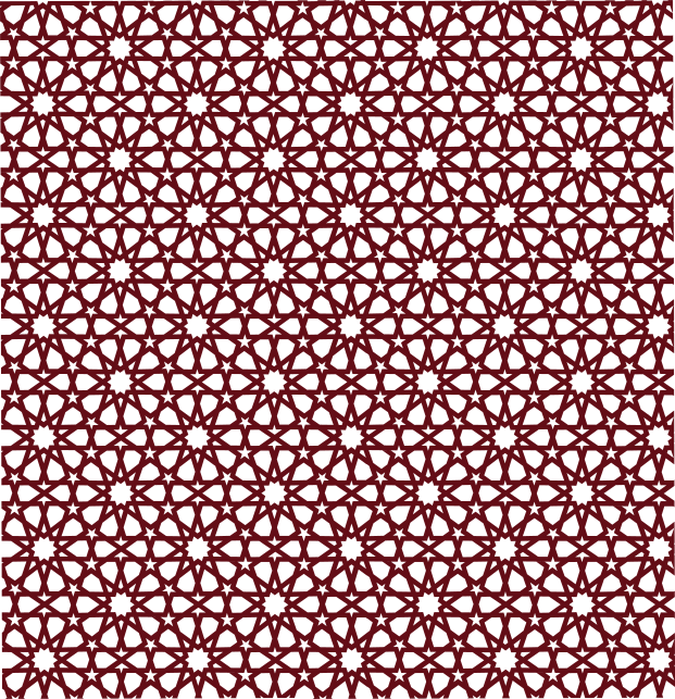
One pattern, one rule for using it. A ten-point star rosette in an interlacing girih construction — the decagonal system found across Islamic architecture from Cairo to Isfahan, with five-point stars filling the field between the rosettes. It is drawn as a single tile and laid at 3% opacity behind maroon. It is the texture on the prayer timetable masthead and on every page of the yearly calendar, and it is what makes a printed AMS piece recognizable from across a room.
The tile
621 × 642.88 artboard. Shown at full strength in maroon so the geometry reads. The production file draws it white at 3% opacity and is never used this way.
/assets/pattern.svg · specimen: pattern-solid.svg
As it is actually used
Ramadan 1447
رمضان
3% white on maroon
At working strength the star is felt rather than seen. If a reader notices the pattern before they notice the words, it is too strong.
Rules
- Do: Only on maroon or ink. The pattern is a lightening of a dark field and does nothing on cream.
- Do: Only behind a masthead, a cover, a footer or a full-bleed panel — never behind running text.
- Do: Scaled to fill the block and centered within it, never repeated as a tile.
- Do: Opacity stays at 3%. It is a texture, not a graphic.
- Do: Content always sits on top of it — the pattern is a background layer, never in front of type or imagery.
Not this
- Do not: The pattern in gold, or in any color other than white-on-dark.
- Do not: Tiled at small scale as a repeating wallpaper — it turns into noise.
- Do not: Behind body copy, tables or forms.
- Do not: A different geometric pattern sourced elsewhere because it "looked similar".
- Do not: A plain dot-grid texture used in older materials. It is not part of this identity and should be replaced with the star, or removed.
The skyline
A one-color elevation of the masjid, symmetrical about its centre: the dome beneath its spire and crescent finial, a raised parapet block to either side, and a scalloped crenellation running out to both edges. Below the roofline the drawing resolves into a solid band filling the lower 56% of the artboard, and that band is where the type goes.
It is architecture, not a mark. It carries no name and signs nothing, so a piece that runs the skyline still carries a lockup somewhere on it. One placement, and no second: it closes a piece. Opening one is the logo’s job.
 (313) 849-2147 · 9945 W Vernor Hwy, Dearborn, MI 48120 · services@amsdearborn.org
Footer band
Full bleed across the foot of the page, with the phone, address and email reversed in cream inside the solid band.
- Artboard
- 3840.29 × 752.64 · 5.102 : 1
- Solid band
- 56% of the height
- Across a letter page
- 1.67in deep, 0.93in of it band
- Minimum
- 720px wide on screen · 5in in print
In use: The yearly calendar footer, contact line reversed in the band. Master: /assets/ams-skyline.svg
Rules
- Do: Full bleed, edge to edge. The crenellation is cut mid-merlon at both edges and only resolves when it runs off them.
- Do: Scaled to the full width of the piece, with the height following. Across a letter page that is 1.67in deep, 0.93in of it solid band.
- Do: Deepened by extending the band, never by stretching the drawing. The lower half is flat maroon and grows downward invisibly.
- Do: Placed at the foot of the page, upright, with the band below the roofline exactly as it sits on the building.
- Do: Cropped from the ends where a narrower format needs it, so long as the dome and its crescent finial stay in frame. Trim both ends equally and the dome stays centred.
- Do: Drawn in one color, in the same three finishes as the logo: maroon on cream, white on maroon, ink for one-color work.
- Do: Type set inside the solid band, and once per piece — a page gets one skyline.
Not this
- Do not: Flipped, mirrored or rotated. The masjid has one way up, and an inverted roofline reads as an upside-down building rather than as a border.
- Do not: Run across the head of the page. The skyline closes a piece; opening one is the logo’s job, and the masthead patterns in section 07 are how that is done.
- Do not: Screened back to sit behind a cover. A faded skyline is not a watermark; if the silhouette is wanted quietly, place it at full strength in a tint of the ground, exactly as the mark does.
- Do not: Used as a field texture. Texture behind a cover or a masthead is the girih pattern at 3%, and a piece does not get both.
- Do not: Standing in for the logo. It carries no name and signs nothing — a piece using it still carries a lockup.
- Do not: Cropped past the dome, or a bare length of parapet run on its own. Without the dome it is a wall, not the masjid — and a dome lifted out of it is not an ornament.
- Do not: Stretched to fill a wider format, squashed to save depth, or redrawn with more merlons.
- Do not: Over photography, outlined, shadowed, or given a gradient sky. Its ground is cream, maroon or ink and nothing else.
Ornament
Two rules and one divider, all in gold. Between them they handle every separation the identity needs; a piece that wants a fourth kind of divider wants more whitespace instead.
Short rule
A 4–6rem gold hairline under a heading or between a heading and what follows. The default divider on the website.
Full rule
The same hairline run edge to edge, fading out at both ends. Separates a utility bar from the navigation beneath it.
Diamond divider
Two gold diamonds around a hairline. Ceremonial — a masthead, a cover, a certificate. Centered, never left-aligned.
Photography
The archive is the strongest asset American Moslem Society has: the Highland Park mosque in the 1920s, the 1952 stairway, the dome against the Ford Rouge smokestacks. Use it unretouched — no filters, no duotone, no maroon wash. Historical images stay black and white because that is what they are. Contemporary photography is warm and available-light, and shows the building in use rather than empty. Every image gets a caption with a date; an undated photograph of a community is a decoration, not a record.
Applications
Mastheads, buttons, cards and the prayer timetable.
The identity assembled. Each of these is a real, in-production composition — reproduced here so a new piece can be built by matching one rather than inventing from the rules.
The masthead
The single most important composition in the system: it opens every printed piece and every page of the yearly calendar. Round mark, English name over the pillars in gold, Arabic name over the Arabic pillars, mirrored. On maroon, with the star pattern behind it.
American Moslem Society
Outreach, Education, Development, Services
الجمعية الإسلامية الأمريكية
دعوة، تعليم، تنمية، خدمات
Fixed height. English left, Arabic right, mark on the English side. The two languages sit at the same optical weight — neither is a subtitle of the other.
The timetable header
The three-panel header of the monthly prayer timetable: contact on the left, the Hijri month in the center, Jumu’ah times on the right, divided by gold hairlines. The center panel is the one to study — Foda for the Arabic month and the Friday-prayer labels, Fraunces for the English and the year, Archivo for the Gregorian range, with the diamond divider between them.
9945 W Vernor Hwy, Dearborn, MI 48120
Main (313) 849-2147
رمضان
Ramadan
1447
February 18 – March 19, 2026
Three equal panels, gold hairlines between them. Gold-light throughout, because the primary gold fails contrast on maroon.
Timetable body
Maroon header row with the Arabic prayer name above the English. Alternating columns in the table stripe, Friday reversed into maroon across the whole row, Ramadan tinting the Fajr and Maghrib columns in gold. Every figure is tabular.
| العشاءIsha | المغربMaghrib | العصرAsr | الظهرDhuhr | الفجرFajr | اليومDay |
|---|---|---|---|---|---|
| 10:01 | 8:31 | 5:07 | 1:28 | 5:42 | THU |
| 10:02 | 8:32 | 5:08 | 1:28 | 5:41 | FRI |
| 10:03 | 8:33 | 5:09 | 1:28 | 5:40 | SAT |
Friday is reversed, not merely tinted — it is the row most people are looking for. The gold cells show the Ramadan treatment on Fajr and Maghrib.
Buttons
Fully rounded, always. Primary is maroon-800 with cream text and hovers to maroon-900; secondary is a hairline border on the page ground; tertiary is a text link with a trailing arrow. One primary button per view — if two things are equally important, neither is.
Header and footer

The American Moslem Society is a registered 501(c)(3) non-profit organization. Donations are tax-deductible to the extent allowed by law.
A maroon-700 utility bar, a gold hairline, the Long lockup with uppercase navigation, and an ink footer carrying the Simple mark reversed.
Assets
Every logo file, and where the fonts come from.
Eighteen SVG files — five logo patterns and the skyline, each in three finishes — plus PNG exports for the tools that cannot take a vector. SVG is the master everywhere it is accepted: it stays sharp at any size and carries the exact brand colors, which a PNG resampled by somebody’s slide deck will not.
The complete logo kitAll 18 SVGs, 24 PNG exports and a usage summary · 2.3 MBDownloadEvery file

















PNGs are transparent, 1024px on the long edge. The Round pattern also ships at 512px and 192px for app icons and avatars.
The skyline





The skyline’s PNGs are 3840px wide rather than 1024px, because it is only ever placed at the full width of a page. Section 06 has the rules for using it.
The pattern
Ten-point girih tile
pattern.svg · 621 × 642.88

Source of truth
Every file above is generated from seven master artworks, never edited by hand. If a file here looks wrong, the fix happens at the master and everything downstream is regenerated from it — request that through the Media Committee rather than patching an export.
Fonts
Four of the five are free and linked to their source. Gill Sans Nova is licensed from Monotype and is not distributed here — but because the wordmark is supplied as artwork, the only people who need a license are those setting new Latin display type in it, which the rules already discourage.
Fraunces
Display serif
SIL Open Font License 1.1 — free for any use, including embedding
Gill Sans Nova
Wordmark
Commercial — licensed from Monotype. A desktop or web license must be purchased.
Archivo
Text & interface sans
SIL Open Font License 1.1 — free for any use, including embedding
Foda
Arabic display
Foda Free Font, © Foda 2023 — free to use
Amiri
Arabic text
SIL Open Font License 1.1 — free for any use, including embedding
Questions
Anything this handbook does not answer — an unusual format, a co-branded piece, a vendor asking for a file type that is not here — goes to the Media Committee at media@amsdearborn.org. Getting an answer takes a day. Guessing wrong takes a reprint.